Introduction
In my previous article, I gave a general introduction to the basics of The HyperText Markup Language (HTML) as well as The Document Object Model (DOM). To briefly review, HTML provides a general scaffolding onto which stylings (via Cascading Style Sheets) and interactivity (via JavaScript) can be utilized to render pages and applications on the Web. Having a basic understanding of HTML, and how the DOM renders and organizes HTML elements, is a necessary prerequisite to garnering further knowledge on how to style the web. This article, very much in the spirit of the previous, is meant as a general introduction to the basics of how to do said styling, using Cascading Style Sheets, more commonly known as CSS.
The Cascade
CSS, at its essence, is a style sheet language, which when utilized by web developers or users of web pages/applications, allows for the selective styling of HTML elements. Through an algorithm native to the Web Browser known simply as the CSS Cascade, CSS is used to color, style, and format elements within the HTML document based on a prerogative series of determinant rules that are based off of the browser's native user-agent and/or the web developer's authored stylesheets.
The topics of the User-Agent and the user-agent styles are separate subjects in their own right, but for both brevity and simplicity's sake, one can think of the user-agent styles as being the default stylings rendered by your browser when no author stylesheets are provided. This is why basic HTML documents are still rendered in a human readable fashion, even when no custom stylings are configured.
An entire blog post could be written regarding the topic of the CSS Cascade, but to be honest, the in depth understanding of the concept is not at all necessary to getting started with CSS. Nevertheless, I felt it was important to address the subject at least in part, as even basic knowledge of the CSS Cascade will eventually prove invaluable in understanding how CSS is rendered in the browser as one becomes more versed in designing web pages. In the following sections regarding Inline Styles and Author Stylesheets, how The CSS Cascade influences the rendering of the web page will hopefully become more apparent.
Inline Styles
The easiest way to demonstrate CSS basics is to build off of our previous knowledge on HTML. Let's use our previous article's basic HTML document as a starting point:
<!--hello_world.html-->
<!DOCTYPE html>
<html lang="en">
  <head>
    <title>My Hello World Example</title>
    <meta charset="UTF-8" />
    <meta name="viewport" content="width=device-width, initial-scale=1" />
    <link href="css/style.css" rel="stylesheet" />
  </head>
  <body>
    <main>
      <article>
        <h1>Hello World!</h1>
        <p>
        Lorem ipsum dolor sit amet, consectetur adipiscing elit, sed do eiusmod
        tempor incididunt ut labore et dolore magna aliqua. Ut enim ad minim
        veniam, quis nostrud exercitation ullamco laboris nisi ut aliquip ex ea
        commodo consequat. Duis aute irure dolor in reprehenderit in voluptate
        velit esse cillum dolore eu fugiat nulla pariatur. Excepteur sint
        occaecat cupidatat non proident, sunt in culpa qui officia deserunt
        mollit anim id est laborum.
        </p>
      </article>
    </main>
  </body>
</html>
As you may recall, this is a very basic HTML document, with many HTML elements commonly seen in standard web pages. While the appearance of this document is rather bland, as it utilizes the default user-agent styles native to our web browser, we can start to change this default styling using CSS. To simply dive in, let's start by adding a style attribute to our <h1> and <p> tags:
<!--hello_world.html-->
<h1 style="text-decoration-line: underline">Hello World!</h1>
    <p style="color: red">
    Lorem ipsum dolor sit amet, consectetur adipiscing elit, sed do eiusmod
    tempor incididunt ut labore et dolore magna aliqua. Ut enim ad minim
    veniam, quis nostrud exercitation ullamco laboris nisi ut aliquip ex ea
    commodo consequat. Duis aute irure dolor in reprehenderit in voluptate
    velit esse cillum dolore eu fugiat nulla pariatur. Excepteur sint
    occaecat cupidatat non proident, sunt in culpa qui officia deserunt
    mollit anim id est laborum.
    </p>
If we then render this page in our browser, we will see our HTML page now has some additional stylings added: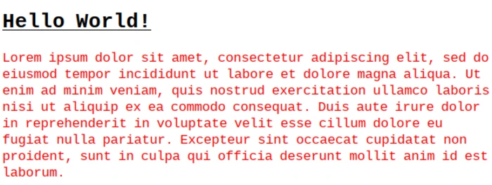
As you can see, applying the style attribute to the <h1> and the <p> tags, and then inputting specific property/value text that CSS recognizes, visually changes the text of the targetted HTML elements (specifically underlining the text of the <h1> tag and coloring the text of the <p> tag red). This is what is known as "inline-styles," which is appropriately named due to the CSS being defined directly in the HTML itself.
We will cover the properties specifically defined within this style attribute shortly. As you may imagine, this convention of defining CSS styles directly in the HTML document itself could quickly become cumbersome, as the more CSS properties you may wish to define, the rather lengthy (and possibly unreadable) your HTML document will be. This convention of defining inline styles is useful however, in understanding the CSS Cascade, but only when in comparison and contrasted with other aspects of it, like Author Stylesheets.
Author Stylesheets
The above markup code demonstrating inline-styles is an example of what is known as Author Styles. As the name implies, these are styles that are authored by a web developer or user, which changes the default stylings native to the browser's User-Agent. As mentioned previously, the practice of authoring syles directly in our HTML document via inline-styles, while useful, can quickly become cumbersome as more stylings are authored and applied.
To ensure readability and organization of code, oftentimes styles are relegated to their own .css file, and then imported via the HTML <link> tag. You may have taken note of this tag in our example HTML document as one of the children elements within the <head> element:
<!--hello_world.html-->
<!DOCTYPE html>
<html lang="en">
  <head>
    <title>My Hello World Example</title>
    <meta charset="UTF-8" />
    <meta name="viewport" content="width=device-width, initial-scale=1" />
    <link href="css/style.css" rel="stylesheet" />
  </head>
Very essentially, this tag tells the browser to import the styling configurations within the style.css file, which is located within the css directory related to the current working directory. The "rel" attribute explicitly tells the browser that the relationship between this import and the HTML document as a stylesheet. Let's now style our HTML document in a similar fashion as before when we exemplified the use of inline-styles, but now utilize this stylesheet. From the command line, make a directory called "css", and then create a file within that directory, called "style.css":
#bash shell
[ ~]$ mkdir css && touch css/style.css
Now, open this style.css file in your text editor and input the following CSS code:
/*style.css*/

h1 {
  text-decoration-line: underline;
}

p {
  color: red;
}
As you can see, this CSS is immediately more readable than when it was configured instead as an inline-style directly within our HTML document. Let us now take a brief moment to analyze the anatomy of this very basic .css file.
As you may have guessed, the first line indicating the name of a file is also there to demonstrate the appropriate way to make comments in CSS. Encapsulated within a forward slash and asterix, and ending with an asterix followed by a forward slash, this line will not be rendered by the browser's CSS parser, but like all code comments, is useful for brief notes to developers about the code itself.
The first element that we encounter is specifically the h1 element, which is listed simply on its own line followed by an opening curly brace. The h1 text is what is known as a CSS selector. As the name implies, this selector will "select" all instances of the <h1> tag within our HTML document and apply the stylings that are encapsulated between the curly braces.
Within the curly braces, there is the text "text-decoration-line", which is the CSS property that we, the web developer, are indicating we wish to change from its default value. The following specification, "underline", configures all instances of the <h1> tag to have their inner text underlined.
Together with the property, text-decoration-line, as well as the property value, underline, we the web developer have created what is known as a CSS "declaration". The following image, taken from the official MDN web docs, illustrates this concept for us visually: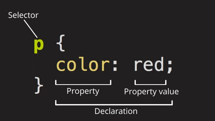
Basic CSS Styling
The majority of CSS styling paradigms across the web reflects this general pattern of creating a CSS declaration and configuring various properties/values within the confines of their respective selectors. Let's continue styling the text within our example <p> tag with multiple property configurations within the same CSS declaration:
/*style.css*/

h1 {
  text-decoration-line: underline;
}

p {
  color: red;
  font-size: 150%;
  font-weight: bold;
  margin-left: 16px;
}
If we then render these multiple style configurations in the browser, we can easily see the adjustments made to our <p> tag's text.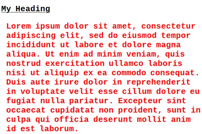
Each <p> tag will have this styling now applied to it. To ensure this is the case, let's adjust our HTML document to have a secondary <p> tag so that we can see these same stylings applied to this secondary element:
<!--hello_world.html-->
<!DOCTYPE html>
<html lang="en">
<head>
<title>My Hello World Example</title>
<meta charset="UTF-8" />
<meta name="viewport" content="width=device-width, initial-scale=1" />
<link href="css/style.css" rel="stylesheet" />
</head>
<body>
<main>
<article>
<h1>Hello World!</h1>
<p>
Lorem ipsum dolor sit amet, consectetur adipiscing elit, sed do eiusmod
tempor incididunt ut labore et dolore magna aliqua. Ut enim ad minim
veniam, quis nostrud exercitation ullamco laboris nisi ut aliquip ex ea
commodo consequat. Duis aute irure dolor in reprehenderit in voluptate
velit esse cillum dolore eu fugiat nulla pariatur. Excepteur sint
occaecat cupidatat non proident, sunt in culpa qui officia deserunt
mollit anim id est laborum.
</p>
</article>
</main>
</body>
</html>
As one would expect, by using the CSS selector p, we have essentially declared that all configurations made within the CSS block (otherwise known as a "ruleset" or "rule") will be applied to all <p> tag HTML elements. Indeed, if we now render this newly edited HTML document in the browser, we will see that these stylings are applied to the secondary <p> tag's inner text as well, without having to write any additional CSS code: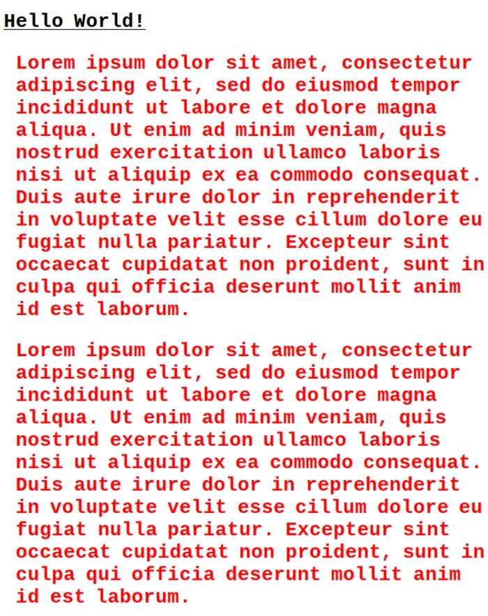
Let's now further style our h1 CSS declaration to further demonstrate how CSS parses the HTML document. Additionally, we'll further configure our style.css file to utilize conventions more commonly seen in web development. For one, we'll change the p CSS declaration to utilize color hex codes instead of the more basic color name code. This is so that a wider variety of colors are available to utilize, and because it corresponds with standards seen throughout the graphic design world.
We'll also change out our default fonts to show a bit of diversity to our text elements. And lastly, we'll utilize a different measurement unit instead of the px or "pixels" unit. We will replace it with the em unit as it is a better practice to use a relative unit over an absolute unit. We will go into more details regarding the use of the px and the em units shortly. For now, let's adjust some of our CSS code:
/*style.css*/

h1 {
  text-align: center;
  font-family: "Trebuchet MS", "Lucida Sans Unicode", "Lucida Grande", "Lucida Sans", Arial, sans-serif;
  text-decoration-line: underline;
  text-decoration-line: none;
}

p {
  color: #f6283d;
  font-size: 150%;
  font-family: Arial, Helvetica, sans-serif;
  font-weight: bold;
  margin-left: 1em;
}
This is now a bit closer to some more real world CSS configurations. Our h1 element now has it's alignments set to center. Much like a word processor generated document, text in CSS can indeed be aligned to either the right, center, or left (the default). The font-family property has a rather extensive series of configurations. Essentially CSS will look for font-families by these name within the Client computer's font libraries (fonts located directly on the user's computer). Should the first font not be found, the second, then third, then fourth, etc. font families will be attempted, with the last font family being one that is commonly found on the majority of Client computers, which is set to the default should the others not be found.
Following this, the font-size for the h1 selector is set to 3em. The em unit of measurement is one of many units of measurement available in CSS for a variety of selectors. While px is perhaps the most commonly recognized unit of measurement to those who are familiar with Graphic Design, pixels are generally frowned upon to be utilized within styling web pages in CSS. This is not to say that there is never a use case for using the px unit of measurement, but due to it being a "fixed" unit of measurement, it is not suitable for most modern web pages as it does not scale relative to the designated font it is being applied to.
The utilization of em units is a good segue into the subject of responsiveness within Web Design. Because modern web pages generally are meant to be viewed on devices with many different screen dimensions (commonly known as "viewports" in web development), it is imperative that elements be scaled relative to the client device's default settings for font size and other user-agent defaults. While one could, in theory, utilize px units to create responsive web designs, the amount of configuration necessary to do so in a way that still created a visually appealing (or at least readable) web page would be far more difficult than utilizing a relative measurement unit like em. This brief CSS Tricks blog post explains the reasoning behind this in more detail.
Lastly, we see that the text-decoration property's value is written twice, this is to demonstrate a simple, but important aspect of the CSS cascade, which is that properties within a CSS selector can be overwritten anywhere in the .css document. This is accomplished simply by rewriting the text-decoration-line property's value at any point in the .css file after the initial reference to it. To be clear, in our first declaration of text-decoration-line: underline;, we are overwriting the default user-agent setting of "none" for this property to "underline". In our second declaration, we then explicitly declare that the value of the text-decoration-line property is none.
From a practical standpoint, this is a useless re-declaration, but I put this within the sample CSS code for demonstration purposes. Oftentimes when working in a large CSS configuration file, it is easy to forget a previously authored style, and it can sometimes come as a shock to the web developer that their styling now seems somehow off due to an overwritten property value that was designated further down in the .css file. This is due to how the CSS Cascade Algorithm determines certain properties to be adjusted (either by conditions met within the User-Agent, or by the conditions met in the Authored Stylesheet).
I will digress on this demonstration of a basic feature of the CSS Cascade for now. Let us return our attention to the effects of our new CSS code. If we now render our HTML page, we will see that it is now noticably different due to these slightly more significant changes: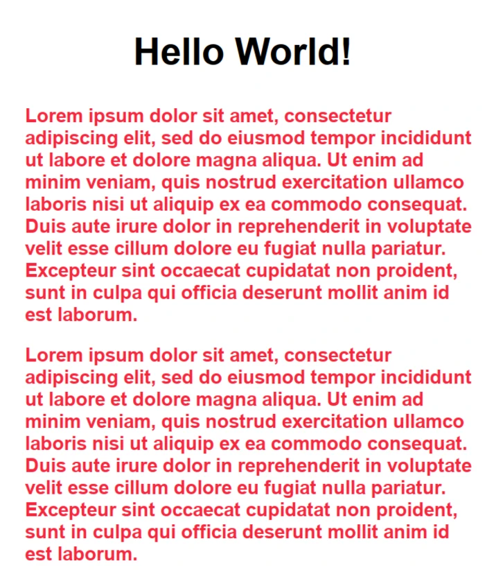
Sensible Defaults
To say that the CSS styling language is vast is not only an understatement, but perhaps does a great disservice to those that have devoted the immense amount of time necessary to gain mastery over it. Additionally there are a variety of CSS frameworks that aim to increase developer productivity and improve the developer experience when working with CSS. This article aims only to give you an introduction to CSS, its basic concepts, and its syntax. That said, however, it is also my wish as the author of this article to leave you with a good starting off point from which to further research CSS and develop your skills in it.
To that end, below is a sample default .css file that I use when I initially start a new project. There are a multitude of these default .css files available from a wide variety of developers far more skilled and knowledgable on the subject of CSS than myself. Indeed, this configuration is essentially lifted from the Youtuber and CSS King, Kevin Powell, who I highly encourage everyone reading this article and interested in learning more about CSS to check out. Below you will find these default CSS settings and a brief explanation on what these defaults do:
/*defaults-style.css*/

*,
*::before,
*::after {
  box-sizing: border-box;
}

:root {
  color-scheme: light dark;
}

body {
  font-family: system-ui;
  font-size: 1.125rem;
  line-height: 1.5;
}

main {
  width: min(70ch, 100% - 4rem);
  margin-inline: auto;
}

img,
svg,
video {
  max-width: 100%;
  display: block;
}
This .css file obviously includes some CSS selectors that we have not yet covered in this introduction. Let's start simply by breaking down this file line by line. I will forego explaining the first commented out section of this file, as I have already covered what this is earlier in this article.
The asterix, *, selector here is what is known in programming circles as a "wildcard" character. It essentially means any and all elements. Since there are no parent selectors preceding it, this wildcard is selecting every element within the HTML document. Very essentially, * is taking every element within the HTML page and changing its user-agent value for the box-sizing property and changing it from its default, content-box, to border-box.
The commas following the selectors indicate that the declaration below is to be applied to these selectors as well. In this case, we have another piece of syntax that has yet to be introduced, which is that of psuedo elements, delineated by the double colon syntax, ::, followed in this case by the before, and after keywords. To greatly oversimplify what this indicates, these pseudo-elements are elements that don't exist as actual HTML elements within the DOM, but are still capable of being styled by CSS. Visually speaking, these elements will appear as if they are a part of the usual HTML document, but will not affect the overall flow of it. If this sounds confusing to you, do not fret, pseudo-elements are only used in specific scenarios where styling of visual elements are needed to appear before or after specific HTML elements. In this particular case we again, are applying any and all pseudo-elements to be styled to have their border-sizing property's value changed to border-box.
So why change every element in the HTML document as well as all pseudo-elements to not utilize the default content-box value? To understand this in more depth than is presented here, please see MDN's documentation on the CSS Box Model. In brief, however, when changing the width and height of an HTML element within CSS, the adjustments to these property values only are applicable to the content within said element (in most cases, the element's text content). Oftentimes this is not what the majority of web developers want, as they wish to change the width and height of the entire element, including any borders, margins, and padding applied to said element. This change to the border-box value for the box-sizing property value ensures that the document defaults to what is usually the expected and desired behavior.
Moving on, we encounter the :root CSS selector. It is easy to confuse the :root pseudo class selector with the * selector or the html selector. :root is utilized here to select the <html> tag. Note here that it is used instead of the html CSS selector solely because it holds higher precedence within the CSS Cascade (for all intents and purposes they are nearly identical selectors). Within the declaration block, we see that the color-scheme property is being set to light dark. This essentially tells HTML to respect the browser's preference for either light or dark theme and therefore instructs the browser's CSS parser to coerce any stylings to reflects this preference if available.
Next we have the body selector, where we see that the font-family is set to the system-ui value. As the value name suggests, this is simply telling the browser to initially set all text to whatever the browser's preference for the font family is.
Additionally the font-size property is set to 1.125rem. Yet another subject not covered previously in this article, this measurement unit, rem, is utilized to reference the root element's default font-size. This is contrasted with the unit, em, which references the parent element's default font-size. Both these units have similar behaviors, but rem can be thought of as being a safer bet for default stylings when there are compounding font-size changes over many nested elements within an HTML document.
Lastly, the line-height property is changed to 1.5, which simply adjusts from the default line-height of 1 so that the text has a bit more breathing room for each line (1 tends to leave little space inbetween lines).
Moving onto the main selector, we find a very sane default for the width property, which utilizes the min() CSS function. We didn't cover CSS functions (and indeed, haven't covered the basics of programming functions in general), but the concepts in this case are relatively straight forward. Demarcated by comma separated values, the min() function takes two arguments, the first being the minimum value passed to the width property. In this case, each line of text within the main selector, will be a minimum of 70ch, or 70 characters, long. The second argument, expressed as 100% - 4rem, basically tells the browser that the widest any block of text within the main selector can be is 100% of the width of the browser window, but subtract 4rem from that to find the maximum width the content can be. The margin-inline property takes the auto value to indicate that the inline margins (side margins) should be automatically calculated. Thanks to the width property's min() function's return value, the margin surrounding this content will conform to this defined range.
Finally we move onto the img, svg, and video selectors. What these are in reference to is somewhat self explanatory, but essentially we are referencing all HTML visual elements that refer to images (i.e. <img>), <svg> elements (otherwise known as scalable vector graphics), and also the <video> element (self-explanatory). The defaults changed here are subtle, essentially the width of the video is limited to being 100% of the max-width property, ensuring that all images, svg elements, and videos never exceed 100% width of the browser window size (preventing content overflow), and additionally the display property is set to block, essentially starting all new images, svgs, and videos on new lines instead of visually adjacent (i.e. horizontally oriented/side by side) to other HTML elements.
As I initially mentioned in the opening paragraph to this section, these are just a few of sane defaults that can be found throughout the internet in regards to default author stylings for css documents. I encourage you to go looking for others as there are some css default sheets that can get quite extensive. Personally, I've found this is enough for me, but you might desire to have others depending on your goals and work flow.
Conclusion
Hopefully this introduction to Cascading Style Sheets has proved to be of some use to you. This article just barely scratches the surface of what is possible just with HTML and CSS, let alone JavaScript. If you are inclined to do further research into CSS, I would highly recommend you to look at the official MDN documentation on CSS Basics, as well as the highly acclaimed CSS Tricks website. These resources have proved to be immensely valuable in my endeavors when creating web pages, and I am sure they will serve you as well.
We have now covered The HyperText Markup Language, a skeletal scaffolding onto which we can apply Cascading Style Sheets, a beautiful mask of makeup applied to this structure. But much like Pygmalion wishing for his creation to come to life, web developers are left only with a beautiful, but still immobile, statue. Only when we apply the magic of that ubiquitous programming language, JavaScript, can our creation be given Muscles, and come to life.
